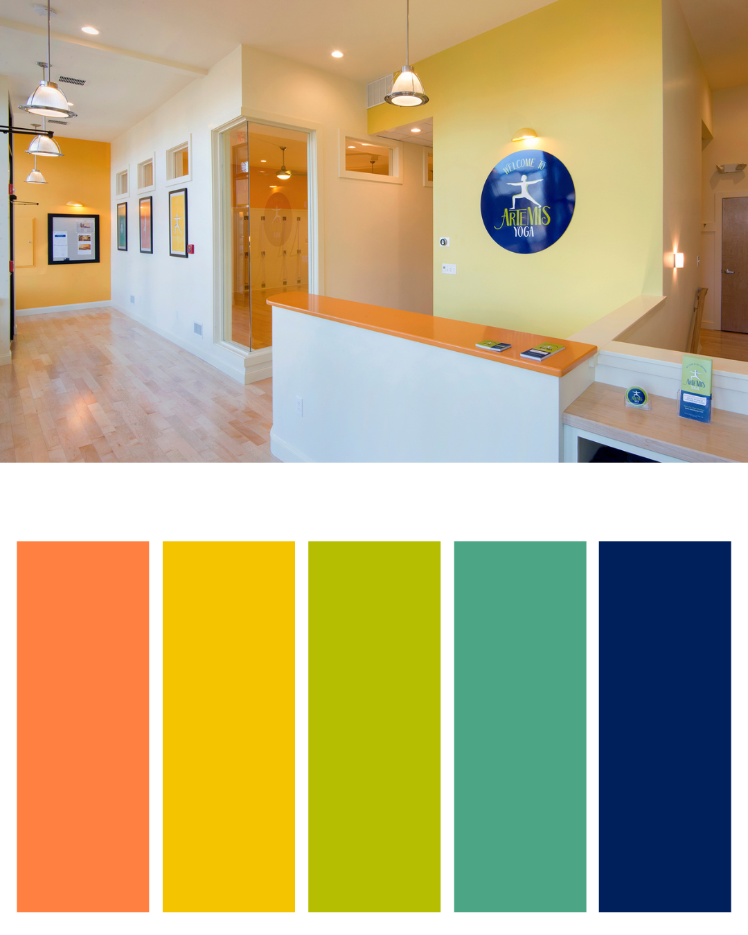
 Choosing the name Artemis Yoga was apt as it represents one who is healthy and vigorous and who grants strength and health to others. Underpinning this is a set of core values that our community is friendly, approachable, instructional, unpretentious and encouraging. To support these values, we chose a suite of brand colors that evoke a peaceful invitation with warm yellow and orange and spring green and indigo blue. From the beginning, Liz worked closely with Katie Bielawski of Fantabulous Design to bring it all to life, from colors and logo, to signage, brochures and more.
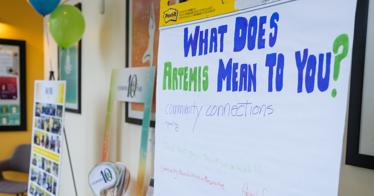
So, 10 years later, when thinking about how to celebrate our anniversary milestone, it was important to recognize that Artemis Yoga continues to be an inviting, welcoming community.
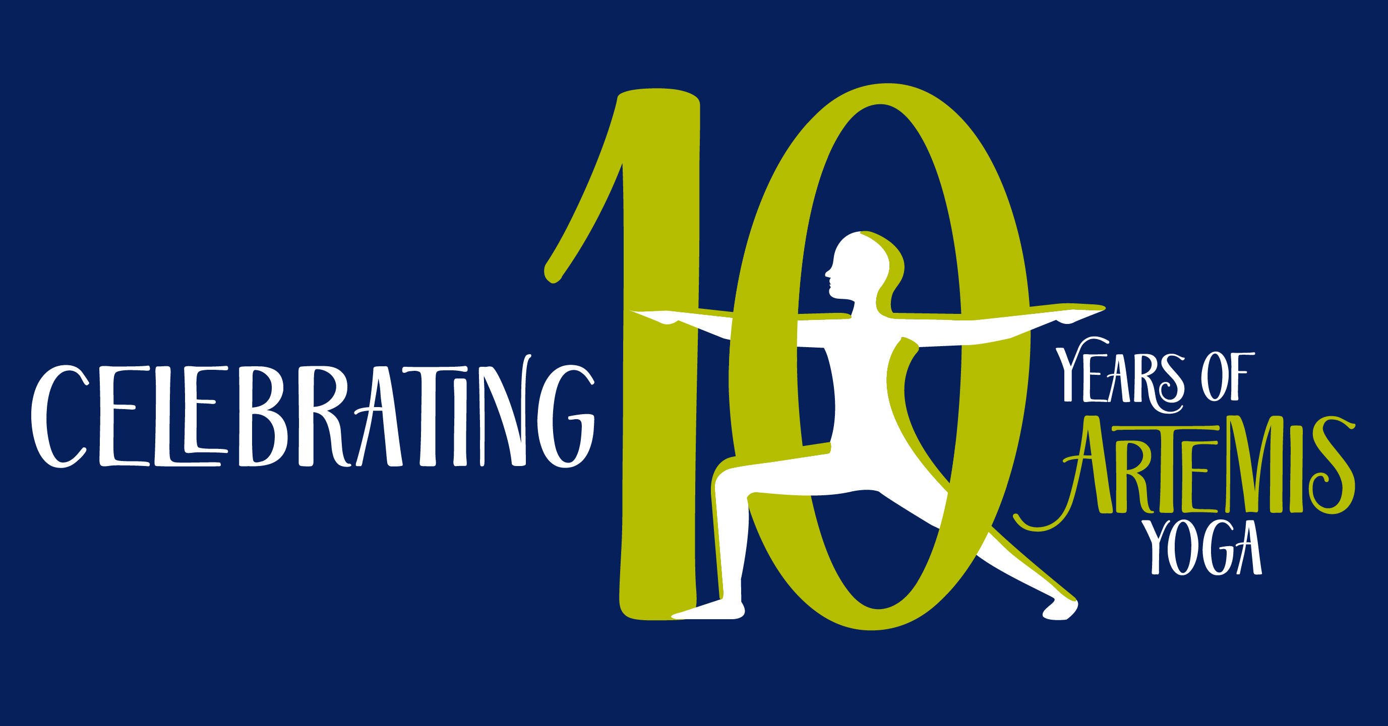
 In looking at our icon logo, the warrior, with its shadow outline, represents not only the shape of a pose with hints of alignment but also the connection of student to teacher. From the beginning the Artemis warrior was designed to represent anyone who is seeking graceful strength and resilience and that is still true today. Now to honor our 2025 milestone year, Artemis the Warrior is exulting at a decade with this community by extending legs and arms, with a bit of whimsy, reaching from our beginnings through and beyond our 10-year milestone.
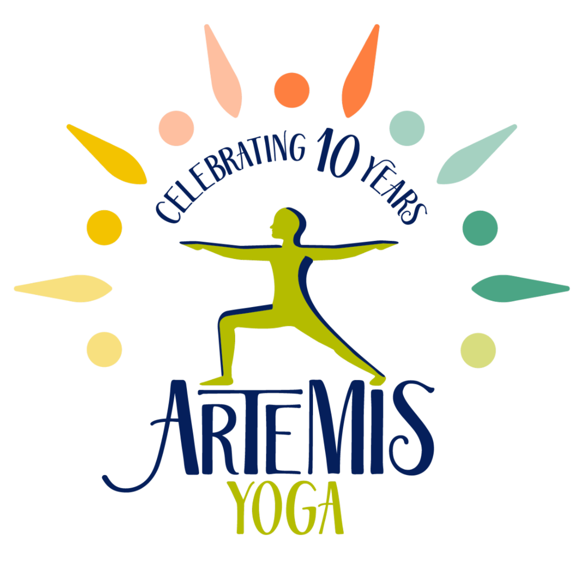 The celebration effect in our 10-year brand logo with the arc of color surrounding the yogi in the center unites the community. The colorful dashes and dots create an embrace as yogis gather and share space together. You can imagine the different colors and shapes to be yoga mats, different students learning in unison. There is a sense of joy as you visualize yogis welcoming others to learn and practice in community.
These new aspects of our beautiful logo represent that every day at Artemis Yoga we celebrate you, our students, and our wonderful team of teachers and staff. Thank you for 10 years together.